Typography helps set the tone and reinforces the overall character of the company. Consistent, thoughtful use of type ensures clear communication and visual harmony across all materials.
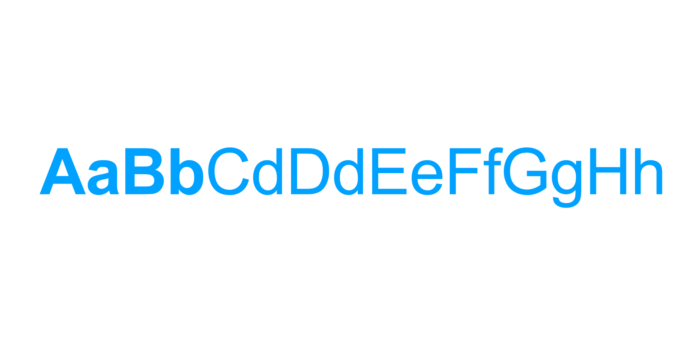
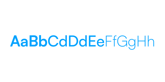
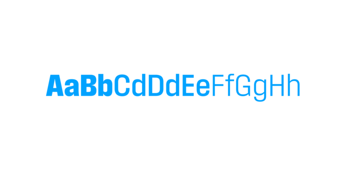
Satoshi Variable is the primary typeface for all communications. With a wide range of weights and a clean, approachable design, it’s flexible enough for headlines, body copy, and everything in between.
Field Gothic is reserved for callouts, pull quotes, or moments that require added emphasis or typographic contrast. Use it sparingly to highlight key messages or create visual interest.
When the primary typefaces are unavailable, Arial may be used as an alternative, especially in system limited environments or shared documents where installing custom fonts isn’t possible.